The Categorical Imperative: How Pretty Figures, Category Theory, and a Little Damn Common Sense Rescue Broken Physics
 # The Categorical Imperative: How Pretty Figures, Category Theory, and a Little Damn Common Sense Rescue Broken Physics
You know the scene: an elegant derivation on the left, a stubborn experiment on the right, and a graduate student stuck in the middle whose job is to make them kiss. When equations proclaim perfection and the world answers with exceptions, scientists do what responsible adults do — we make prettier pictures.
Pretty figures aren’t just vanity; they’re tools. They translate singularities into smoothed cores, algebraic idealizations into topological realities, and opaque numerics into contours you can squint at over bad coffee. Let’s take a tour — part ode, part cautionary tale — that stitches together insights from analysis, topology, numerical methods, category theory, and logic. I’ll be playful (because why not), balanced (because it’s important), and mildly opinionated (because someone needs to say it).
## Singularities, regularization, and the Lamb–Oseen glow
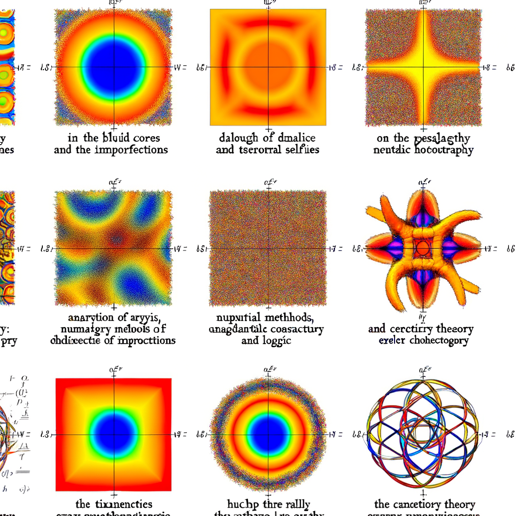
Analysis gives you the textbook vortex: velocity ∝ 1/r, a katana-sharp singularity at the center. Beautiful on paper, useless in a bathtub. Real fluids have viscosity; they regularize. The Lamb–Oseen vortex replaces a vertical cliff with a gentle bell — the singularity is mollified.
Why the figure matters: a high-res cross-section makes that smoothing obvious. The plot is doing math for you: it’s visual regularization. From a PDE point of view, you’ve replaced a distributional nightmare with a smooth classical solution; numerically, you’ve enforced a physically meaningful cutoff. Both views are true. Both are necessary.
## Symmetry breaking, topology, and triangular rebellion
Topology and symmetry arguments tell you what *can* happen; dynamics tell you what *will* happen. A perfectly symmetric vortex sounds lovely — until a perturbation exploits an unstable mode and three satellite vortices pop out, arranging themselves like a tiny, angry tricycle.
A good figure shows the emergent structure: cores, circulation signs, and separating streamlines. Topologists will point out invariant sets and bifurcation classes; physicists will show you the experimental run where the symmetry died. Both descriptions are complementary, and neither replaces the other.
## Heat maps, dissipation, and numerics of cruelty
Two plates, a sulking viscous fluid, and opposite motion: suddenly the velocity field looks mean and the temperature field tells the story. These thermal selfies are not decorative — they’re diagnostics for wear, failure, and inefficiency.
Numerical analysts will remind you: resolution, discretization, and schemes matter. A coarse mesh hides boundary layers; an under-resolved solver invents spurious oscillations. High-res figures are the countermeasure. They reveal where the numerics are lying and where the physics is genuinely dramatic.
But be warned: color scales are persuasive. A rainbow palette can make tiny differences look catastrophic; a bad choice of normalization can hide divergence under the rug. Pictures rescue broken physics — until they rescue the wrong conclusion.
## Wakes, base-bleed, and the politics of the void
From aerodynamics comes a good engineering lesson: blunt bodies leave low-pressure wakes that eat energy. Base-bleed — injecting gas into the wake — fills that void and reduces drag. Mach-number contours and vector plots tell a crisp before-and-after story.
This is where modelers, experimentalists, and engineers converge. Contours show cause-and-effect in a single glance. But remember: models with tuned base-bleed parameters can match data without explaining sensitivity. A nice contour is not the same as a robust proof.
## Electrons, cavities, and categorical diagrams
Swap fluids for electrons and you’re in a cavity magnetron. Standing-wave patterns impose organization, and electron density plots make abstract eigenmodes tactile. Peaks and troughs in a high-res map correspond to resonant structure you can almost hear.
Here, the categorical viewpoint is neat: diagrams aren’t just pretty; they’re relationships. A commutative diagram in category theory enforces that different routes — different models or numerical approximations — lead to compatible results. Visualizing those routes (numerical method A vs. B, continuum model vs. experiment) helps you see when a diagram “commutes” in practice and when it doesn’t.
Category theory gives you the language to say, precisely: these processes compose, these morphisms preserve structure, and these two approximations are equivalent up to a natural transformation. In slang: it’s the formalization of that warm, fuzzy feeling you get when different maps of reality agree.
## Logic, proof, and the seductive confidence of pictures
Different forms of logic matter too. Constructive logic asks for explicit witnesses — the computational content of approximations. Model theory asks if your visualized numerics actually satisfy the axioms you think they do. Non-classical logics (probabilistic, fuzzy) can better capture the uncertainty in a noisy experimental contour.
A high-resolution plot is an argument: it’s evidence, not the theorem. If you treat it as the final proof, you’re doing something slightly dangerous. On the other hand, refusing to accept a clear visual discrepancy because “the analytical solution says otherwise” is equally foolish. Logic and pictures must talk.
## Two sides of the coin
Pictures compress complexity. They make patterns visible and let humans iterate rapidly. They’re indispensable in debugging models, persuading reviewers, and teaching intuition. But they’re also rhetorically powerful — color and composition can overclaim. Numerics can hallucinate structure; artifacts can masquerade as physics. Proof without evidence is hollow; evidence without rigor is slippery.
So what do we trust? Trust the interplay: rigorous analysis to tell you what to expect, numerics and figures to show what actually happens, topology and category theory to relate different perspectives, and logic to keep your reasoning honest.
## A final thought (and a question)
If you’re nostalgic for hand-drawn proofs and canonical solutions, don’t worry — elegance survives. It just now comes with prettier figures, finer meshes, and an army of postdocs who can make a contour map look like modern art. Those images are not a betrayal of theory; they’re the operational side of it.
I’ll leave you with a question that keeps me awake in a kind, nerdy way: when a picture and a proof disagree, which one do you trust first — and how do you design the conversation between them so that neither gets to be the lone tyrant?