The Categorical Imperative: Why Sexy Plots of Invisible Chaos Matter
 # The Categorical Imperative: Why Sexy Plots of Invisible Chaos Matter
Hook: You’ve scrolled past them—the impossibly crisp heat map, the vortex photo that looks like a planet-forming nebula, the Mach contour that could double as modern art. You probably paused. That pause is the whole point.
Let me be blunt: pretty plots sell grants, attention and sometimes tenure. But underneath the Instagram-ready colors is actual epistemology. Visualization is where equations stop being lonely and start gossiping with humans. From the Lamb–Oseen vortex to an eight-cavity magnetron’s electron density map, a figure condenses centuries of math, a couple of heuristics, and a lot of choices about what to show and hide.
Why you should care (and why your friends at the bar will, too)
Pretty figures are not mere decoration. They are compressed arguments. A temperature heat map tells you about energy budgets. A Mach contour shows shocks and tells a pilot or engineer where the air will rebel. A vector field reveals symmetry or the lack of it. These are claims with data attached, and humans—visual creatures—are wired to trust a good image. That’s both the magic and the menace.
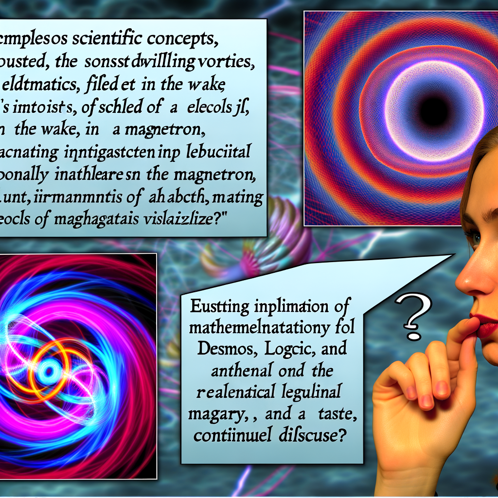
When math gets lonely: the myth of the perfect vortex
First-year physics sells you the ideal vortex: elegant, singular, mathematically delicious. Reality says, “Hold my viscosity.” The Lamb–Oseen model is the polite patchwork that replaces infinities with a Gaussian-ish core. That rounding matters: the core’s structure dictates how a vortex interacts, how it destabilizes, how it mixes.
This is a recurring theme across disciplines: the beautiful simple object (a singular solution, a neat linear operator) gets dressed in reality’s noise (viscosity, boundary layers, nonlinearity). Visualization is where that dressing reveals itself.
Vortices gossip: instabilities and satellite vortices
Give a vortex a nudge and it multitasks: it spawns satellites, folds into polygonal patterns, and generally refuses to be boring. Those satellite vortices are not just pretty—they control mixing rates in rivers, transport in atmosphere, and efficiency of engineered devices. A high-resolution plot of vorticity is a map of where math fails to be tidy and where engineers need to pay attention.
Cross-disciplinary aside: dynamical systems, bifurcation theory and topology
Here’s where we get a little meta. The same math that describes a spinning fluid—nonlinear PDEs, bifurcations, invariant manifolds—shows up in population dynamics, electrical oscillators and even some economic models. Topology gives us tools to classify the qualitative features (e.g., index of a singularity), while dynamical systems tell us how patterns emerge and switch. A figure becomes a categorical statement: “This class of behavior lives here.” If you like the pun as much as I do, visualization acts like a functor mapping messy data to human-intelligible patterns.
Heat maps: the temperature signature of frictional grudges
Slide two plates and you get shear; shear does work; work makes heat. Temperature fields are fingerprints of energy dissipation and, crucially, of modeling choices. Do you resolve the boundary layer? Do you pick a colormap that highlights subtle gradients or washes them out? The colorbar is your honesty meter.
Base bleed: filling the void to go faster
Engineers are magicians who prefer proofs. Base bleed is a surgical trick: fill the low-pressure wake so the blunt body stops paying a pricey drag tax. Mach contours and streamlines before-and-after are visual proof of concept. But beware: simulation resolution, turbulence models, and boundary conditions decide whether the fix looks like genius or snake oil.
Electron choreography: the magnetron’s nightclub
Switch to electromagnetics and you see the same choreography: geometry shepherds electrons into coherent motion. High-resolution plots of electron density or potential in segmented cavities are both art and diagnostics. They reveal standing waves, hotspots, loss mechanisms. Again: pretty = useful, but only if you know which colors correspond to which physics and which numerical approximations are hiding in the corner.
Visualization as logic: categories, models, and inference
Let’s get nerdy in a pleasing way. In logic and model theory, we worry about what a model says and what it omits. In statistics, a visualization is a likelihood-maker: it suggests hypotheses, refutes others, and prompts priors to update. In category-theoretic lingo (because the title demanded it), figures are morphisms between messy, high-dimensional data and the human concept space. They are not truth themselves, but they mediate truth-finding.
The power and the pitfalls
The flip side of all this glory: pretty plots can mislead. Bad colormap choices (I’m looking at you, rainbow), over-smoothing, cherry-picked snapshots, and undocumented preprocessing can turn a visualization into propaganda. Reproducibility demands that we publish not only the picture but the pipeline that made it. As scientists we must be equal parts impresarios and librarians.
Desmos, toys, and pedagogy
Not every visualization requires a supercomputer. Tools like Desmos and interactive notebooks let students poke systems and watch them spit color. That tactile feedback rebuilds intuition in a way lectures don’t. Visualization isn’t just for selling results; it’s for making thought experiments tangible.
A balanced plea
So here’s my categorical imperative—yes, a Kant pun because why not: make your pictures honest. Use them to reveal assumptions, not to bury them. Celebrate the sexy plots, but publish the code, the colorbars, the boundary conditions. Teach students to both make and mistrust pretty figures. The world is messy; our job is to make that mess legible, not prettier than it is.
Parting (open) question
If visualization is the bridge between equations and intuition, how do we design that bridge so it’s both beautiful and epistemically rigorous—especially when beauty is so damn persuasive?
What would you build differently?