The Categorical Imperative: Sexy Heat Maps and the Art of Making Chaos Look Pretty
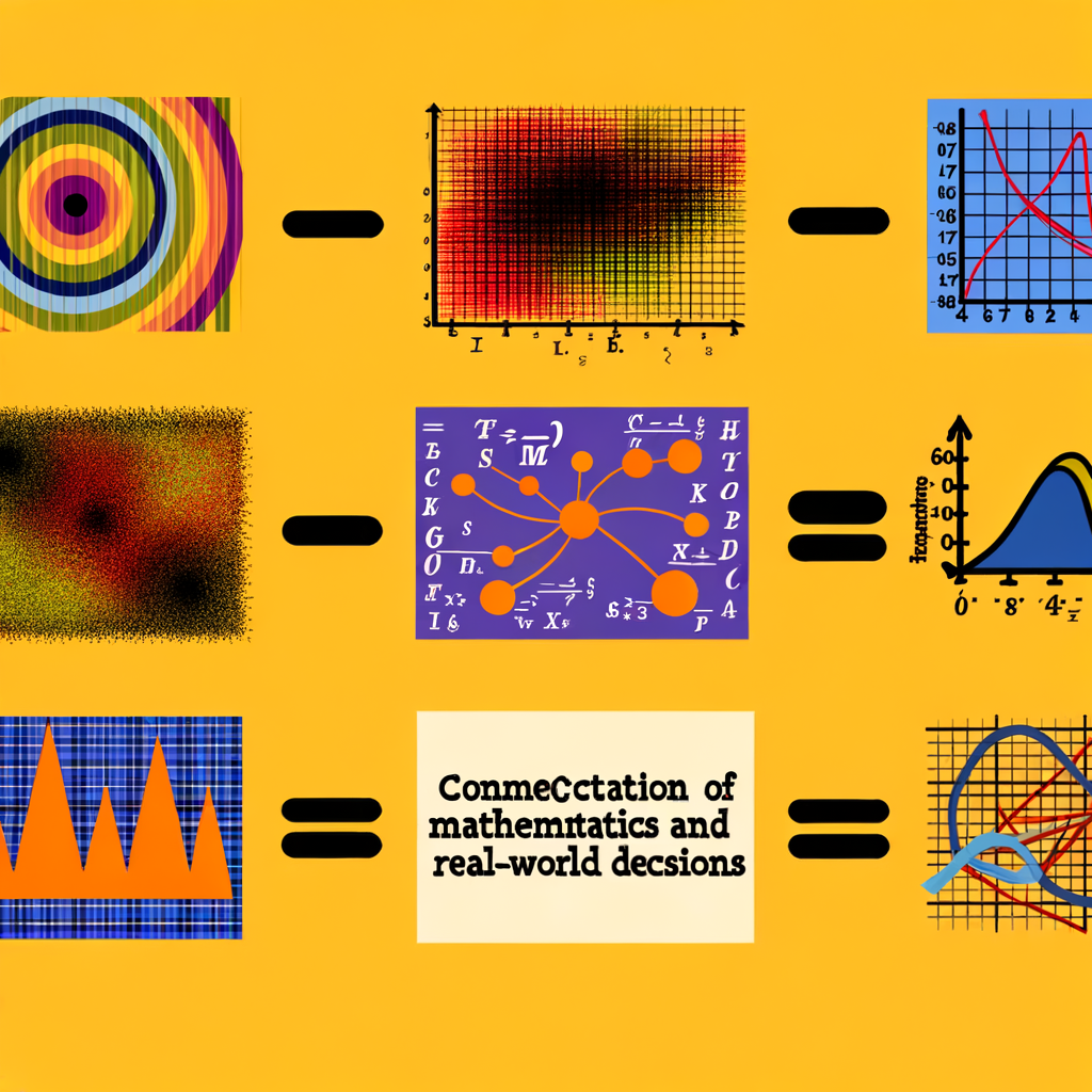 # Sexy Heat Maps, Category Theory, and Why Pretty Pictures Matter
If you’ve ever watched a colleague gasp at a colorful contour plot like it was a Renaissance painting, welcome to the club. Give chaos a colorbar and suddenly it’s tasteful — an instant authority figure in a PDF. But there’s a little more going on than aesthetics. As someone who spends half her time loving the math and the other half policing bad metaphors, I’d like to walk through why those sexy heat maps seduce us, what different branches of math and logic reveal about that seduction, and where we should be a little damned suspicious.
## The seduction: legible chaos
Heat maps, vector fields, Mach contours — call them what you want — they perform a miracle. They translate partial differential equations, boundary layers, and microscopic interactions into a visual grammar our brains are shockingly good at parsing. You can see instabilities, eddies, wakes, and electron bunching without reading a single eigenvalue or Sturm-Liouville problem. That’s not just convenience. It’s epistemology: the map becomes evidence.
But why do these images feel so convincing? A few reasons:
– They crisply encode gradients, symmetries, and scale separation (which are exactly the things scientists care about).
– Humans are pattern-seeking machines; visual patterns shortcut lengthy computations in our heads.
– Good visuals suggest control: if you can show the problem in color, you can gesture to where you’ll intervene.
## Cross-disciplinary lenses: what math tells us about prettification
Let’s pick through a few mathematical viewpoints and see what they offer.
– Dynamical systems: Those swirling Lamb–Oseen vortices are textbook examples of how singular solutions are regularized in the real world. A PDE might admit a blow-up in the idealized limit, but viscosity, finite core size, and perturbations produce structure — and structure is beautiful. Dynamical systems teaches us to look for attractors and bifurcations; pretty plots often reveal the qualitative behavior more quickly than spectra.
– Probability & statistics: A heat map is often a marginal: we’ve integrated out degrees of freedom to display something digestible. That’s powerful, but it hides assumptions. The map’s message depends on priors (what you assumed away), smoothing kernels, and sampling density. Miss those, and the picture is an artifact, not a fact.
– Topology & geometry: Visualizations highlight invariants — circulation, homology classes of coherent structures, or conserved quantities. Category theory, my favorite philosophical playmate, gives a higher-level view: diagrams and morphisms tell you which transformations preserve meaning. Two very different models can produce visually similar heat maps if they’re connected by the right functors; categorically, the picture may be an isomorphism of insight rather than an isomorphism of mechanism.
– Logic & model theory: Here’s the stern voice: a picture is not a proof. Visual intuition can suggest conjectures and counterexamples, but formal verification belongs to proof. The logic perspective reminds us that inference requires attention to premises — the plot folds in assumptions like boundary conditions and discretization choices, and those are logically prior to the conclusion.
## The good: habilitating intuition and accelerating discovery
I’ve sat in labs where a single colormap changed the direction of a project. Why? Because the map served as a hypothesis generator. Seeing a triangular instability in a vortex plot prompts you to try a symmetry-breaking analysis. Watching a wake shrink in base-bleed simulations suggests a modest hardware tweak. Visuals democratize debugging: they let people who can’t solve the Navier–Stokes hierarchy still catch the important stuff.
Tools like Desmos are a game-changer here. They put the visual language of mathematics into the hands of students, designers, and communicators. A slider that reveals a bifurcation beats a page of equations in one crucial metric: speed. Fast intuition + slow rigor is a productive combo.
## The bad (and the ugly): when visuals mislead
Pretty pictures can also hide the uglier bits.
– Smoothing and interpolation can invent spurious structure. A nice color gradient looks scientific even when it’s just linear interpolation between sparse data.
– Color maps lie. Color perception is nonlinear; some palettes emphasize midrange variation and mask extremes (seriously, stop using rainbow by default). The choice of normalization can be propaganda in a lab coat.
– Confirmation bias: we love visuals that confirm our priors. A tempting vector field might be the very artifact we introduced to make our model “behave.”
Mathematically, these are warnings about model error, identifiability, and invariance: visually similar outputs do not guarantee equivalent generative mechanisms. Category theory would smile wryly here — you can have a commutative diagram that hides a nasty noninvertible map.
## A balanced take: use visuals as negotiators, not arbiters
The happy compromise is to let visuals be the negotiator between theory and experiment. They should suggest where to intervene, not dictate the intervention. Use a heat map to find the hot spot, then go measure, compute, and prove. Treat the figure as a proposal: “Here’s where the model says the physics hurts — now let’s be methodical about fixing it.”
That means documenting choices: color scales, grid resolution, solver details, and any smoothing. Make the figure reproducible. If you’ve ever sat through a talk where the presenter’s claim lives and dies by a colormap you can’t replicate, you know the pain.
## Why all this matters beyond vanity
For a generation raised on instant visuals and meme culture, images are not decoration — they’re a mode of argument. A well-crafted figure does three jobs at once: it diagnoses, it persuades, and it proposes. That’s real power. But it’s also responsibility. The ease with which we can make things look convincing demands higher standards of honesty.
So yeah, I’ll keep making heat maps. They’re delightful. But I’ll also annotate my damned assumptions, pick accessible palettes, and check that the pattern isn’t just my numerical algorithm flirting with me.
## Parting thought
Visuals are the most democratic form of mathematical speech we have. They invite people in, shorten the path to insight, and — when used responsibly — they accelerate both discovery and translation to practical fixes. But like any persuasive technology, they can be abused.
If heat maps are the rhetoric of modern science, what constraints should we accept to ensure they remain honest rhetoricians and not flattering liars?