The Categorical Imperative: Count It, Chart It, Care About It
 # The Categorical Imperative: Count It, Chart It, Care About It
If your childhood memory includes Dad with a clipboard tallying trick-or-treaters like he’s auditing the census, congratulations — you’ve been raised by a social scientist. Counting isn’t just for bureaucrats and data bros; it’s a tiny ethical act. You observe, you record, you think. That’s the modest categorical imperative I want to riff on: do the counting, then be forced by the numbers to care.
This is not a plea to fetishize graphs. It’s a plea to give counting the right amount of humility and heat. Whether you’re cataloging costume types on October 31st or plotting seven million Venezuelan departures across a continent, the math you choose (and the logic you lean on) shapes whether you illuminate or dehumanize.
## Small ledgers, big lessons
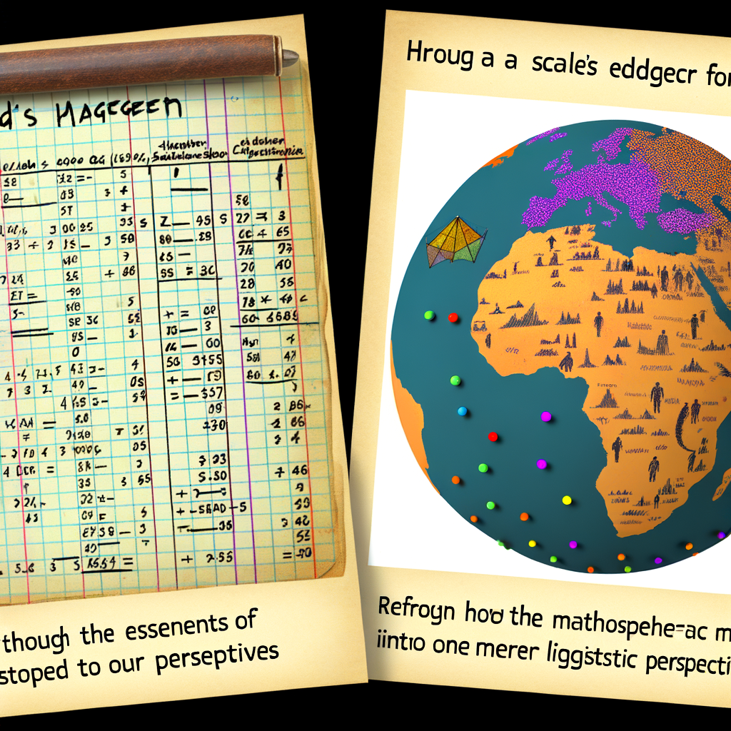
My dad’s Halloween ledger is a masterclass in micro-empiricism. He didn’t just note totals; he timestamped arrivals, scribbled costume categories, and — bless him — tracked candy diplomacy: which sweets got refused, which were traded. From that silly ledger you can teach yourself a lot of applied math:
– Probability & distributions: is arrival time unimodal or multimodal? Is there a rush at 7:15 p.m.? Is it Poisson-ish or clearly clustered?
– Time series & seasonality: year-on-year trends, sticky habits, repeating households.
– Classification & clustering: costume types, candy preferences, or neighborhood subgroups.
– Bias & sampling: who stops by your house is not a random draw from the neighborhood; account for selection effects.
Those are the same conceptual tools you’d use for much larger questions. The only difference is scale and consequence.
## From ledgers to logic: what math brings to the table
Different mathematical lenses answer different moral and pragmatic questions. Here’s a tour without the academic snobbery:
– Statistics (frequentist and Bayesian): tells you what’s likely and how uncertain that is. Bayesian thinking in particular forces humility: priors make explicit our assumptions. If you ignore them, you’re doing little more than pushing numbers through a blender.
– Graph theory & networks: perfect for migration flows. People don’t teleport — they travel along edges. A flow graph (Sankey, for the visual crowd) shows relationships, bottlenecks, and hubs in ways a simple choropleth can’t.
– Topology & geometry: useful when spatial contiguity matters. Are migrants moving in waves along corridors? Topological thinking resists the illusion that borders are clean cuts on a continuous lived landscape.
– Measure theory & normalization: a choropleth without population normalization is lying politely. Density > raw count; per-capita tells a fairer story.
– Logic (predicate, modal, causal): data alone is silent about causality. Causal logic — Judea Pearl style or potential-outcomes frameworks — helps separate correlation from plausible mechanism. Modal logic (what could have happened under different policies?) keeps us honest about counterfactuals.
– Category theory (yes, really): when you want abstractions that let you move between contexts without losing structure, category theory is a weirdly elegant guide. Think of functors as rules that translate a small household ledger into a migration dataset’s schema without collapsing meaning. Mildly nerdy, hugely clarifying when you’re building pipelines.
Math gives tools; logic gives restraint. Use both.
## The seductive danger of numbers
Here’s the flip side: numbers can anesthetize empathy. A million becomes a headline, not a migration of households, jobs, and lost livelihoods. There are three common sins:
1. Reification — treating aggregates as agents (“Venezuelans did X”).
2. Overprecision — plotting with decimal points that imply false certainty.
3. Omission — failing to note who’s missing from the data (undocumented migrants, unreported flows, silent losses).
Ethics in visualization is about resisting these sins. Label your axes. Show uncertainty. Annotate policy events. And for God’s sake, avoid logarithmic scales without explanation unless you enjoy being a chart-gremlin.
## Practical heuristics for humane counting
If you want to do this well without becoming a data monk, here’s a checklist:
– Normalize by population where intensity matters.
– Prefer flow diagrams for movement, time series for dynamics, maps for distribution.
– Annotate charts with policy or social events — they’re the narrative glue.
– Show uncertainty (error bars, credible intervals) — the world is messy and we should admit it.
– Combine macro visuals with micro-stories — a map plus a single representative quote is surprisingly grounding.
Tools are secondary. Start in a spreadsheet. Graduate to RawGraphs, Figma, or Python/R when you need reproducibility. The tool should serve the question, not the other way around.
## Logic, argument, and the public thread
Online forums — those gloriously chaotic open threads — are where novices and pros collide. Post a sketch. Ask a dumb question. You’ll get everything from elegant solutions to pedantic nitpicks and, yes, that one person insisting on a pie chart. That messy chorus is pedagogy: the feedback loop that polishes thinking.
From a logic standpoint, community critique enforces different norms: proof-checking in math, peer review in statistics, interpretive critique in narrative visuals. The public thread is where your priors meet reality and politely get revised.
## A gentle realpolitik
There are trade-offs. If you spend forever perfecting your visualization you’ll miss the moment when your insight mattered. But if you rush, you risk misleading people. The right balance is iterative humility: publish a clear version, with caveats, then refine in public.
Also — and this is a small moral brawl — sometimes a clean, simplified visual is the only thing that will move policy. Simplicity can persuade; complexity can inform. Both are necessary. The trick is to use each where appropriate and to flag the limits of the simpler piece.
## Wrap (with a categorical question)
Counting is a moral act as much as a technical one. When you tally, you create a claim about the world that demands responsibility: choose your measures, be explicit about assumptions, and humanize the dots. Mathematics and logic give you the frameworks to do that thoughtfully; humor and humility keep you from becoming a chart-obsessed bore.
So here’s the question I’ll leave you with, because I like to tinker with your conscience: when your numbers point to an uncomfortable truth, do you refine your method, change your mind, or weaponize the chart? Which of those feels most categorical to you — and why?